/* ================= TOKENS ================= */ :root{ --cream:#FBF6EF; --cream-deep:#F4ECDF; --ink:#2B2B28; --ink-soft:#6b6760; --teal:#4F8A93; --teal-deep:#2E545C; --teal-pale:#CFE6E8; --gold:#C9A769; --gold-soft:#EDE0C4; --blush:#D9A38A; --white:#FFFFFF; --shadow: 0 20px 60px -25px rgba(46,84,92,0.35); --radius-lg: 28px; --radius-md: 18px; --ease: cubic-bezier(.22,.61,.36,1); } *{margin:0;padding:0;box-sizing:border-box;} html{scroll-behavior:smooth;} body{ font-family:'Jost',sans-serif; color:var(--ink); background:var(--cream); -webkit-font-smoothing:antialiased; overflow-x:hidden; } img{display:block;max-width:100%;} a{text-decoration:none;color:inherit;} ul{list-style:none;} .container{ max-width:1240px; margin:0 auto; padding:0 32px; } section{position:relative;} .section-pad{padding:120px 0;} @media(max-width:768px){ .section-pad{padding:80px 0;} .container{padding:0 22px;} } h1,h2,h3,h4{ font-family:'Cormorant Garamond',serif; font-weight:600; color:var(--teal-deep); line-height:1.15; letter-spacing:.01em; } .eyebrow{ font-family:'Marcellus',serif; font-size:13px; letter-spacing:.28em; text-transform:uppercase; color:var(--gold); display:inline-flex; align-items:center; gap:14px; margin-bottom:18px; } .eyebrow::before{ content:''; display:inline-block; width:34px;height:1px; background:var(--gold); flex-shrink:0; } @media(max-width:480px){ .eyebrow{ font-size:11px; letter-spacing:.14em; gap:10px; } .eyebrow::before{ width:20px; } } .script{ font-family:'Petit Formal Script',cursive; color:var(--teal); font-size:1.5em; font-weight:400; } .lede{ font-size:18px; line-height:1.8; color:var(--ink-soft); max-width:540px; } .section-head{ text-align:center; max-width:680px; margin:0 auto 64px; } .section-head.left{ text-align:left; margin:0 0 56px; } .section-head .lede{ margin:0 auto; } .section-head.left .lede{ margin:0; } /* ================= BUTTONS ================= */ .btn{ display:inline-flex; align-items:center; gap:10px; padding:17px 34px; border-radius:100px; font-family:'Jost',sans-serif; font-size:14px; font-weight:500; letter-spacing:.06em; text-transform:uppercase; border:1px solid transparent; cursor:pointer; transition:transform .45s var(--ease), box-shadow .45s var(--ease), background .35s, color .35s, border-color .35s; white-space:nowrap; } .btn-primary{ background:var(--teal-deep); color:var(--cream); box-shadow:0 14px 30px -14px rgba(46,84,92,0.55); } .btn-primary:hover{ transform:translateY(-3px); box-shadow:0 20px 40px -16px rgba(46,84,92,0.6); background:var(--teal); } .btn-outline{ background:transparent; border-color:rgba(46,84,92,0.25); color:var(--teal-deep); } .btn-outline:hover{ border-color:var(--teal-deep); transform:translateY(-3px); background:rgba(46,84,92,0.05); } .btn-whatsapp{ background:var(--gold); color:var(--teal-deep); box-shadow:0 14px 30px -14px rgba(201,167,105,0.7); } .btn-whatsapp:hover{ transform:translateY(-3px); background:var(--gold-soft); } .btn svg{ width:17px; height:17px; flex-shrink:0; } .btn-sm{ padding:12px 24px; font-size:12px; } /* ================= NAV ================= */ .nav{ position:fixed; top:0; left:0; right:0; z-index:200; padding:26px 0; transition:background .5s var(--ease), padding .5s var(--ease), box-shadow .5s var(--ease); } .nav.scrolled{ padding:14px 0; background:rgba(251,246,239,0.85); backdrop-filter: blur(14px); box-shadow:0 8px 30px -20px rgba(46,84,92,0.4); } .nav .container{ display:flex; align-items:center; justify-content:space-between; } .brand{ display:flex; align-items:center; gap:12px; } .brand img{ height:52px; width:52px; border-radius:50%; object-fit:cover; transition:height .5s var(--ease), width .5s var(--ease); } .nav.scrolled .brand img{ height:42px; width:42px; } .brand-text{ font-family:'Cormorant Garamond',serif; line-height:1.05; } .brand-text .name{ font-size:22px; font-weight:600; color:var(--teal-deep); display:block; } .brand-text .by{ font-family:'Petit Formal Script',cursive; font-size:15px; color:var(--gold); } .nav-links{ display:flex; gap:38px; align-items:center; } .nav-links a{ font-size:13px; letter-spacing:.14em; text-transform:uppercase; color:var(--teal-deep); font-weight:500; position:relative; padding-bottom:6px; } .nav-links a::after{ content:''; position:absolute; left:0; bottom:0; width:0; height:1px; background:var(--gold); transition:width .35s var(--ease); } .nav-links a:hover::after{ width:100%; } .nav-cta{ display:flex; align-items:center; gap:22px; } .nav-toggle{ display:none; flex-direction:column; gap:5px; cursor:pointer; background:none; border:none; padding:6px; position:relative; z-index:320; } .nav-toggle span{ width:24px; height:2px; background:var(--teal-deep); display:block; transition:transform .35s var(--ease), opacity .35s var(--ease), background .35s; } .nav-toggle.active span:nth-child(1){ transform:translateY(7px) rotate(45deg); } .nav-toggle.active span:nth-child(2){ opacity:0; } .nav-toggle.active span:nth-child(3){ transform:translateY(-7px) rotate(-45deg); } .nav-overlay{ position:fixed; inset:0; z-index:280; background:rgba(43,43,40,0.45); opacity:0; visibility:hidden; transition:opacity .45s var(--ease), visibility .45s var(--ease); } .nav-overlay.open{ opacity:1; visibility:visible; } @media(max-width:980px){ .nav-links{ position:fixed; top:0; right:0; height:100vh; width:78%; background:var(--cream); flex-direction:column; justify-content:center; gap:34px; transform:translateX(100%); transition:transform .5s var(--ease); box-shadow:-20px 0 60px rgba(0,0,0,0.08); z-index:300; overflow-y:auto; padding:40px 0; } .nav-links.open{ transform:translateX(0); } .nav-links a{ font-size:18px; } .nav-toggle{ display:flex; } .nav-cta .btn-whatsapp span{ display:none; } .nav-cta .btn-whatsapp{ padding:13px; } } @media(max-width:480px){ .nav-links{ width:100%; } .brand-text .name{ font-size:19px; } .brand-text .by{ font-size:13px; } .brand img{ height:44px; width:44px; } .nav.scrolled .brand img{ height:38px; width:38px; } .nav-cta{ gap:10px; } .btn-sm{ padding:11px 14px; } .nav .container{ padding:0 16px; } } /* ================= POUR DIVIDER (signature element) ================= */ .pour{ position:relative; width:100%; line-height:0; transform:translateY(1px); } .pour svg{ display:block; width:100%; height:auto; } .pour .drip{ transform-origin:top center; animation: drip-grow 2.4s var(--ease) both; animation-play-state:paused; } .pour.in-view .drip{ animation-play-state:running; } @keyframes drip-grow{ 0%{ transform:scaleY(0); opacity:0; } 40%{ opacity:1; } 100%{ transform:scaleY(1); opacity:1; } } /* ================= HERO ================= */ .hero{ position:relative; padding:170px 0 90px; background: radial-gradient(ellipse at 80% -10%, var(--teal-pale) 0%, transparent 55%), var(--cream); overflow:hidden; } .hero .container{ display:grid; grid-template-columns:1.05fr 1fr; gap:60px; align-items:center; } .hero-copy .eyebrow{ opacity:0; animation: rise .9s var(--ease) .1s forwards; } .hero h1{ font-size:clamp(40px,5.4vw,68px); margin-bottom:26px; opacity:0; animation: rise .9s var(--ease) .25s forwards; } .hero h1 em{ font-style:italic; color:var(--gold); } .hero .lede{ opacity:0; animation: rise .9s var(--ease) .4s forwards; margin-bottom:38px; } .hero-actions{ display:flex; gap:18px; flex-wrap:wrap; opacity:0; animation: rise .9s var(--ease) .55s forwards; } @keyframes rise{ from{opacity:0; transform:translateY(26px);} to{opacity:1; transform:translateY(0);} } .hero-visual{ position:relative; aspect-ratio:1/1.05; } .hero-blob{ position:absolute; inset:-8%; background: conic-gradient(from 120deg, var(--teal-pale), var(--gold-soft), var(--blush), var(--teal-pale)); border-radius:48% 52% 58% 42% / 52% 44% 56% 48%; filter:blur(2px); opacity:.65; animation: blob-float 14s ease-in-out infinite; z-index:0; } @keyframes blob-float{ 0%,100%{ border-radius:48% 52% 58% 42% / 52% 44% 56% 48%; transform:rotate(0deg) scale(1); } 33%{ border-radius:58% 42% 46% 54% / 44% 56% 46% 54%; transform:rotate(8deg) scale(1.03); } 66%{ border-radius:42% 58% 52% 48% / 58% 42% 52% 48%; transform:rotate(-6deg) scale(0.98); } } .hero-img{ position:relative; z-index:1; width:88%; margin:6% auto; aspect-ratio:1/1; border-radius:46% 54% 52% 48% / 50% 46% 54% 50%; overflow:hidden; box-shadow: var(--shadow); opacity:0; transform:scale(.92); animation: img-in 1.1s var(--ease) .35s forwards; border:6px solid var(--white); } @keyframes img-in{ to{ opacity:1; transform:scale(1); } } .hero-img img{ width:100%; height:100%; object-fit:cover; } .hero-tag{ position:absolute; bottom:6%; left:-4%; z-index:2; background:var(--white); border-radius:var(--radius-md); padding:18px 24px; box-shadow:var(--shadow); font-family:'Cormorant Garamond',serif; display:flex; align-items:center; gap:14px; opacity:0; animation: rise .9s var(--ease) .9s forwards; } .hero-tag .dot{ width:42px; height:42px; border-radius:50%; background:var(--teal-pale); display:flex; align-items:center; justify-content:center; color:var(--teal-deep); font-size:18px; } .hero-tag b{ display:block; font-size:17px; color:var(--teal-deep); } .hero-tag span{ font-size:12px; color:var(--ink-soft); font-family:'Jost',sans-serif; letter-spacing:.05em; } @media(max-width:980px){ .hero{ padding:140px 0 70px; } .hero .container{ grid-template-columns:1fr; text-align:center; gap:50px; } .hero .lede{ margin:0 auto 32px; } .hero-actions{ justify-content:center; } .hero-img{ width:78%; } .hero-tag{ left:50%; transform:translateX(-50%) scale(1); bottom:-6%; } @keyframes rise{ from{opacity:0; transform:translateY(26px);} to{opacity:1; transform:translateY(0);} } } @media(max-width:480px){ .hero{ padding:120px 0 60px; } .hero-actions{ flex-direction:column; align-items:stretch; gap:14px; } .hero-actions .btn{ justify-content:center; } .hero-img{ width:88%; } .hero-tag{ width:84%; max-width:300px; padding:14px 18px; bottom:-8%; } .hero-tag b{ font-size:15px; } .hero-tag span{ font-size:11px; } } /* ================= REVEAL ================= */ .reveal{ opacity:0; transform:translateY(36px); transition:opacity .9s var(--ease), transform .9s var(--ease); } .reveal.in-view{ opacity:1; transform:translateY(0); } .reveal-stagger > *{ transition-delay: calc(var(--i) * 90ms); } /* ================= ABOUT ================= */ .about{ background:var(--cream); } .about .container{ display:grid; grid-template-columns:1fr 1.1fr; gap:80px; align-items:center; } .about-visual{ position:relative; } .about-frame{ position:relative; border-radius:var(--radius-lg); overflow:hidden; box-shadow:var(--shadow); aspect-ratio:4/5; } .about-frame img{ width:100%; height:100%; object-fit:cover; } .about-badge{ position:absolute; right:-30px; bottom:-30px; background:var(--teal-deep); color:var(--cream); width:150px; height:150px; border-radius:50%; display:flex; align-items:center; justify-content:center; text-align:center; font-family:'Cormorant Garamond',serif; font-size:15px; line-height:1.3; box-shadow:0 20px 40px -18px rgba(46,84,92,0.5); border:1px solid var(--gold); } .about-badge b{ display:block; font-size:30px; color:var(--gold); } .about h2{ font-size:clamp(32px,4vw,46px); margin-bottom:24px; } .about p{ color:var(--ink-soft); line-height:1.9; margin-bottom:18px; font-size:16px; } .about-signoff{ margin-top:28px; display:flex; align-items:center; gap:16px; } .about-signoff .script{ font-size:32px; } .about-signoff small{ display:block; color:var(--ink-soft); font-size:12px; letter-spacing:.12em; text-transform:uppercase; } @media(max-width:980px){ .about .container{ grid-template-columns:1fr; gap:50px; } .about-badge{ width:120px; height:120px; font-size:13px; right:10px; bottom:-20px; } .about-badge b{ font-size:24px; } } @media(max-width:480px){ .about-badge{ width:92px; height:92px; font-size:11px; right:6px; bottom:-14px; } .about-badge b{ font-size:19px; } } /* ================= WHY CHOOSE US ================= */ .why{ background:var(--teal-deep); color:var(--cream); position:relative; overflow:hidden; } .why::before{ content:''; position:absolute; inset:0; background: radial-gradient(circle at 15% 20%, rgba(201,167,105,0.18), transparent 45%), radial-gradient(circle at 85% 80%, rgba(207,230,232,0.12), transparent 45%); pointer-events:none; } .why .section-head h2, .why .section-head .lede{ color:var(--cream); } .why .section-head .lede{ color:rgba(251,246,239,0.7); } .why .eyebrow{ color:var(--gold); } .why .eyebrow::before{ background:var(--gold); } .why-grid{ display:grid; grid-template-columns:repeat(4,1fr); gap:1px; background:rgba(251,246,239,0.12); border:1px solid rgba(251,246,239,0.12); border-radius:var(--radius-lg); overflow:hidden; } .why-item{ background:rgba(46,84,92,0.6); padding:42px 30px; text-align:center; transition:background .4s var(--ease), transform .4s var(--ease); } .why-item:hover{ background:rgba(201,167,105,0.16); transform:translateY(-6px); } .why-item .icon{ width:54px; height:54px; margin:0 auto 20px; color:var(--gold); display:flex; align-items:center; justify-content:center; border:1px solid rgba(201,167,105,0.4); border-radius:50%; } .why-item .icon svg{ width:24px; height:24px; } .why-item h3{ color:var(--cream); font-size:18px; margin-bottom:8px; } .why-item p{ font-size:13px; color:rgba(251,246,239,0.65); line-height:1.7; } @media(max-width:980px){ .why-grid{ grid-template-columns:repeat(2,1fr); } } @media(max-width:560px){ .why-grid{ grid-template-columns:1fr; } } /* ================= COLLECTIONS ================= */ .collections{ background:var(--cream-deep); } .collection-row{ display:grid; grid-template-columns:0.9fr 1.1fr; gap:60px; align-items:center; padding:70px 0; border-bottom:1px solid rgba(46,84,92,0.1); } .collection-row:last-child{ border-bottom:none; padding-bottom:0; } .collection-row:first-child{ padding-top:0; } .collection-row.reverse{ direction:rtl; } .collection-row.reverse > *{ direction:ltr; } .collection-num{ font-family:'Cormorant Garamond',serif; font-size:14px; letter-spacing:.3em; color:var(--gold); margin-bottom:14px; text-transform:uppercase; } .collection-row h3{ font-size:clamp(28px,3.4vw,40px); margin-bottom:16px; } .collection-row p{ color:var(--ink-soft); line-height:1.85; margin-bottom:30px; max-width:460px; } .collection-cards{ display:grid; gap:20px; } .collection-cards.two{ grid-template-columns:1fr 1fr; } .collection-cards.one .card{ aspect-ratio:4/3; } .card{ position:relative; border-radius:var(--radius-md); overflow:hidden; box-shadow:var(--shadow); aspect-ratio:1/1.1; transition:transform .5s var(--ease), box-shadow .5s var(--ease); } .card:hover{ transform:translateY(-8px); box-shadow:0 28px 60px -22px rgba(46,84,92,0.45); } .card img{ width:100%; height:100%; object-fit:cover; transition:transform .8s var(--ease); } .card:hover img{ transform:scale(1.08); } .card-overlay{ position:absolute; inset:0; padding:22px; display:flex; flex-direction:column; justify-content:flex-end; background:linear-gradient(180deg, transparent 45%, rgba(43,43,40,0.78) 100%); color:var(--cream); opacity:0; transition:opacity .45s var(--ease); } .card:hover .card-overlay{ opacity:1; } .card-overlay span{ font-family:'Cormorant Garamond',serif; font-size:20px; display:block; margin-bottom:10px; } .card-overlay a{ display:inline-flex; align-items:center; gap:8px; font-size:12px; letter-spacing:.12em; text-transform:uppercase; color:var(--gold); border-bottom:1px solid var(--gold); padding-bottom:4px; width:fit-content; } /* placeholder illustration cards (jhumka / scented candle) */ .card.illustration{ background:linear-gradient(135deg, var(--teal-pale) 0%, var(--gold-soft) 100%); display:flex; align-items:center; justify-content:center; padding:30px; } .card.illustration svg{ width:60%; height:60%; max-width:160px; } .card.illustration .card-overlay{ background:linear-gradient(180deg, transparent 35%, rgba(46,84,92,0.85) 100%); } @media(max-width:980px){ .collection-row, .collection-row.reverse{ grid-template-columns:1fr; gap:34px; direction:ltr; } .collection-row{ padding:50px 0; } .collection-cards.two{ max-width:420px; margin:0 auto; } } /* ================= GALLERY ================= */ .gallery{ background:var(--cream); } .masonry{ display:grid; grid-template-columns:repeat(4,1fr); gap:18px; grid-auto-rows:120px; } .masonry .g-item{ border-radius:var(--radius-md); overflow:hidden; cursor:pointer; box-shadow:var(--shadow); position:relative; } .masonry .g-item img{ width:100%; height:100%; object-fit:cover; transition:transform .7s var(--ease); } .masonry .g-item:hover img{ transform:scale(1.06); } .masonry .g-item::after{ content:'+'; position:absolute; inset:0; display:flex; align-items:center; justify-content:center; font-family:'Cormorant Garamond',serif; font-size:40px; color:var(--cream); background:rgba(46,84,92,0); transition:background .4s var(--ease), opacity .4s var(--ease); opacity:0; } .masonry .g-item:hover::after{ background:rgba(46,84,92,0.35); opacity:1; } .g-1{ grid-column:span 2; grid-row:span 3; } .g-2{ grid-column:span 2; grid-row:span 2; } .g-3{ grid-column:span 1; grid-row:span 2; } .g-4{ grid-column:span 1; grid-row:span 3; } .g-5{ grid-column:span 1; grid-row:span 2; } .g-6{ grid-column:span 1; grid-row:span 2; } .g-7{ grid-column:span 2; grid-row:span 2; } @media(max-width:980px){ .masonry{ grid-template-columns:repeat(2,1fr); grid-auto-rows:140px; } .g-1,.g-2,.g-7{ grid-column:span 2; } } @media(max-width:560px){ .masonry{ grid-template-columns:repeat(2,1fr); grid-auto-rows:120px; gap:12px; } .g-1,.g-2,.g-3,.g-4,.g-5,.g-6,.g-7{ grid-column:span 1; grid-row:span 2; } .g-1,.g-2,.g-7{ grid-column:span 2; } } .lightbox{ position:fixed; inset:0; background:rgba(43,43,40,0.92); z-index:500; display:flex; align-items:center; justify-content:center; opacity:0; visibility:hidden; transition:opacity .4s var(--ease); padding:30px; } .lightbox.open{ opacity:1; visibility:visible; } .lightbox img{ max-width:90vw; max-height:85vh; border-radius:14px; box-shadow:0 30px 80px rgba(0,0,0,0.5); } .lightbox-close{ position:absolute; top:30px; right:36px; color:var(--cream); font-size:34px; cursor:pointer; font-family:'Cormorant Garamond',serif; line-height:1; } /* ================= CUSTOM ORDERS ================= */ .custom{ background: linear-gradient(135deg, var(--teal-deep), var(--teal)); color:var(--cream); text-align:center; position:relative; overflow:hidden; } .custom::before, .custom::after{ content:''; position:absolute; border-radius:50%; background:radial-gradient(circle, rgba(201,167,105,0.35), transparent 70%); } .custom::before{ width:420px; height:420px; top:-180px; left:-120px; } .custom::after{ width:340px; height:340px; bottom:-160px; right:-100px; } .custom-inner{ position:relative; z-index:1; max-width:680px; margin:0 auto; } .custom h2{ color:var(--cream); font-size:clamp(30px,4vw,46px); margin-bottom:18px; } .custom p{ color:rgba(251,246,239,0.78); font-size:17px; line-height:1.8; margin-bottom:36px; } .custom .eyebrow{ justify-content:center; } @media(max-width:560px){ .custom .btn{ white-space:normal; text-align:center; line-height:1.5; } } /* ================= TESTIMONIALS ================= */ .testimonials{ background:var(--cream-deep); } .t-grid{ display:grid; grid-template-columns:repeat(3,1fr); gap:28px; } .t-card{ background:var(--white); border-radius:var(--radius-md); padding:38px 32px; box-shadow:var(--shadow); transition:transform .5s var(--ease); } .t-card:hover{ transform:translateY(-6px); } .t-stars{ color:var(--gold); font-size:16px; letter-spacing:3px; margin-bottom:18px; } .t-card p{ color:var(--ink-soft); line-height:1.85; font-size:15px; margin-bottom:24px; font-style:italic; } .t-person{ display:flex; align-items:center; gap:14px; } .t-avatar{ width:46px; height:46px; border-radius:50%; background:var(--teal-pale); display:flex; align-items:center; justify-content:center; font-family:'Cormorant Garamond',serif; font-weight:600; color:var(--teal-deep); } .t-person b{ display:block; font-size:14px; color:var(--teal-deep); } .t-person span{ font-size:12px; color:var(--ink-soft); } @media(max-width:980px){ .t-grid{ grid-template-columns:1fr; } } /* ================= FAQ ================= */ .faq{ background:var(--cream); } .faq-list{ max-width:760px; margin:0 auto; } .faq-item{ border-bottom:1px solid rgba(46,84,92,0.15); padding:26px 0; } .faq-q{ display:flex; align-items:center; justify-content:space-between; gap:20px; cursor:pointer; font-family:'Cormorant Garamond',serif; font-size:21px; color:var(--teal-deep); } .faq-q .plus{ flex-shrink:0; width:30px; height:30px; border-radius:50%; border:1px solid var(--gold); display:flex; align-items:center; justify-content:center; position:relative; color:var(--gold); transition:transform .4s var(--ease); } .faq-item.open .faq-q .plus{ transform:rotate(135deg); } .faq-a{ max-height:0; overflow:hidden; transition:max-height .5s var(--ease); } .faq-a p{ color:var(--ink-soft); line-height:1.85; padding-top:16px; max-width:620px; } /* ================= CONTACT ================= */ .contact{ background:var(--cream-deep); } .contact .container{ display:grid; grid-template-columns:1fr 1fr; gap:70px; align-items:start; } .contact-info{ display:flex; flex-direction:column; gap:22px; margin-top:38px; } .contact-line{ display:flex; align-items:center; gap:18px; padding:18px 22px; background:var(--white); border-radius:var(--radius-md); box-shadow:var(--shadow); transition:transform .4s var(--ease); } .contact-line:hover{ transform:translateX(6px); } .contact-line .icon{ width:46px; height:46px; border-radius:50%; background:var(--teal-pale); color:var(--teal-deep); display:flex; align-items:center; justify-content:center; flex-shrink:0; } .contact-line .icon svg{ width:20px; height:20px; } .contact-line b{ display:block; font-size:15px; color:var(--teal-deep); font-family:'Cormorant Garamond',serif; font-size:18px; } .contact-line span{ font-size:13px; color:var(--ink-soft); } .map-placeholder{ margin-top:22px; border-radius:var(--radius-md); overflow:hidden; aspect-ratio:16/9; background: repeating-linear-gradient(135deg, var(--teal-pale) 0 14px, var(--cream-deep) 14px 28px); display:flex; align-items:center; justify-content:center; box-shadow:var(--shadow); position:relative; } .map-placeholder span{ background:var(--white); padding:14px 26px; border-radius:100px; box-shadow:var(--shadow); font-family:'Cormorant Garamond',serif; color:var(--teal-deep); font-size:16px; display:flex; align-items:center; gap:10px; } .contact-form{ background:var(--white); border-radius:var(--radius-lg); padding:46px; box-shadow:var(--shadow); } .contact-form h3{ font-size:28px; margin-bottom:8px; } .contact-form .lede{ font-size:14px; margin-bottom:30px; } .form-row{ display:grid; gap:8px; margin-bottom:22px; } .form-row label{ font-size:12px; letter-spacing:.14em; text-transform:uppercase; color:var(--teal-deep); } .form-row input, .form-row textarea{ border:1px solid rgba(46,84,92,0.18); border-radius:12px; padding:14px 16px; font-family:'Jost',sans-serif; font-size:15px; background:var(--cream); transition:border-color .3s, box-shadow .3s; outline:none; resize:vertical; } .form-row input:focus, .form-row textarea:focus{ border-color:var(--teal); box-shadow:0 0 0 4px rgba(79,138,147,0.12); } .contact-form .btn{ width:100%; justify-content:center; } @media(max-width:980px){ .contact .container{ grid-template-columns:1fr; gap:46px; } .contact-form{ padding:32px 26px; } } /* ================= FOOTER ================= */ .footer{ background:var(--teal-deep); color:var(--cream); padding:80px 0 30px; } .footer .container{ display:grid; grid-template-columns:1.4fr 1fr 1fr 1.2fr; gap:50px; } .footer-brand{ display:flex; align-items:center; gap:14px; margin-bottom:18px; } .footer-brand img{ height:54px; width:54px; border-radius:50%; object-fit:cover; } .footer-brand .name{ font-family:'Cormorant Garamond',serif; font-size:23px; } .footer-brand .by{ font-family:'Petit Formal Script',cursive; color:var(--gold); font-size:15px; } .footer p{ color:rgba(251,246,239,0.65); font-size:14px; line-height:1.8; max-width:300px; } .footer h5{ font-family:'Marcellus',serif; font-size:13px; letter-spacing:.2em; text-transform:uppercase; color:var(--gold); margin-bottom:22px; } .footer ul li{ margin-bottom:12px; } .footer ul a{ font-size:14px; color:rgba(251,246,239,0.75); transition:color .3s, padding-left .3s; } .footer ul a:hover{ color:var(--cream); padding-left:6px; } .footer-socials{ display:flex; gap:12px; margin-top:22px; } .footer-socials a{ width:40px; height:40px; border:1px solid rgba(251,246,239,0.25); border-radius:50%; display:flex; align-items:center; justify-content:center; transition:.3s; } .footer-socials a:hover{ background:var(--gold); border-color:var(--gold); color:var(--teal-deep); } .footer-socials svg{ width:17px; height:17px; } .footer-bottom{ margin-top:60px; padding-top:26px; border-top:1px solid rgba(251,246,239,0.12); display:flex; justify-content:space-between; align-items:center; flex-wrap:wrap; gap:14px; font-size:13px; color:rgba(251,246,239,0.55); } .footer-bottom .script{ color:var(--gold); font-size:18px; } @media(max-width:980px){ .footer .container{ grid-template-columns:1fr 1fr; gap:40px; } .footer-brand .name{ font-size:20px; } } @media(max-width:560px){ .footer .container{ grid-template-columns:1fr; } } /* ================= FLOATING WHATSAPP ================= */ .wa-float{ position:fixed; bottom:28px; right:28px; z-index:300; width:62px; height:62px; border-radius:50%; background:var(--teal-deep); color:var(--cream); display:flex; align-items:center; justify-content:center; box-shadow:0 16px 36px -14px rgba(46,84,92,0.6); transition:transform .35s var(--ease), background .35s; } .wa-float:hover{ transform:scale(1.08) translateY(-2px); background:var(--gold); color:var(--teal-deep); } .wa-float svg{ width:28px; height:28px; } .wa-float::before{ content:''; position:absolute; inset:0; border-radius:50%; border:2px solid var(--gold); animation: pulse-ring 2.6s ease-out infinite; } @keyframes pulse-ring{ 0%{ transform:scale(1); opacity:.7; } 100%{ transform:scale(1.7); opacity:0; } } @media(max-width:560px){ .wa-float{ width:54px; height:54px; bottom:18px; right:18px; } .wa-float svg{ width:24px; height:24px; } } /* reduced motion */ @media (prefers-reduced-motion: reduce){ *{ animation-duration:.01ms !important; animation-iteration-count:1 !important; transition-duration:.01ms !important; } } :focus-visible{ outline:2px solid var(--teal); outline-offset:3px; }
Unique handmade resin creations designed to add beauty to your home or make unforgettable gifts — every piece poured, cured and finished by hand.
D'pour by Sumayyiah began at a small worktable at home — a love for colour, light and texture turned into a craft. What started as a hobby has grown into a one-woman studio where every wall clock, candle and keepsake is mixed, poured, layered and cured by hand.
There are no factories here, no assembly lines — just careful measuring, slow curing, and a deep respect for the materials. Each piece carries small, beautiful imperfections that make it truly one of a kind, the way handmade things should be.
From cosy home décor to meaningful Islamic art pieces and personalised gifts, every order is treated as a small, important project — because to us, it is.
From the first pour to the final polish, every detail is considered — so what arrives at your door feels as special as it looks.
Every piece is hand-poured and finished — no moulds run on autopilot.
Share your colours, names or vision — we create it just for you.
High-grade resin, pigments and finishes built to last for years.
Beautifully packaged pieces ready for birthdays, weddings & more.
From minimalist clocks to framed Quranic verses for every space.
Carefully wrapped and cushioned so it arrives exactly as it left us.
Simple, friendly ordering — chat with us directly, no account needed.
Loved by repeat customers across Karachi and beyond.
Each collection is rooted in the same idea — pour by pour, layer by layer, made to be lived with and loved.
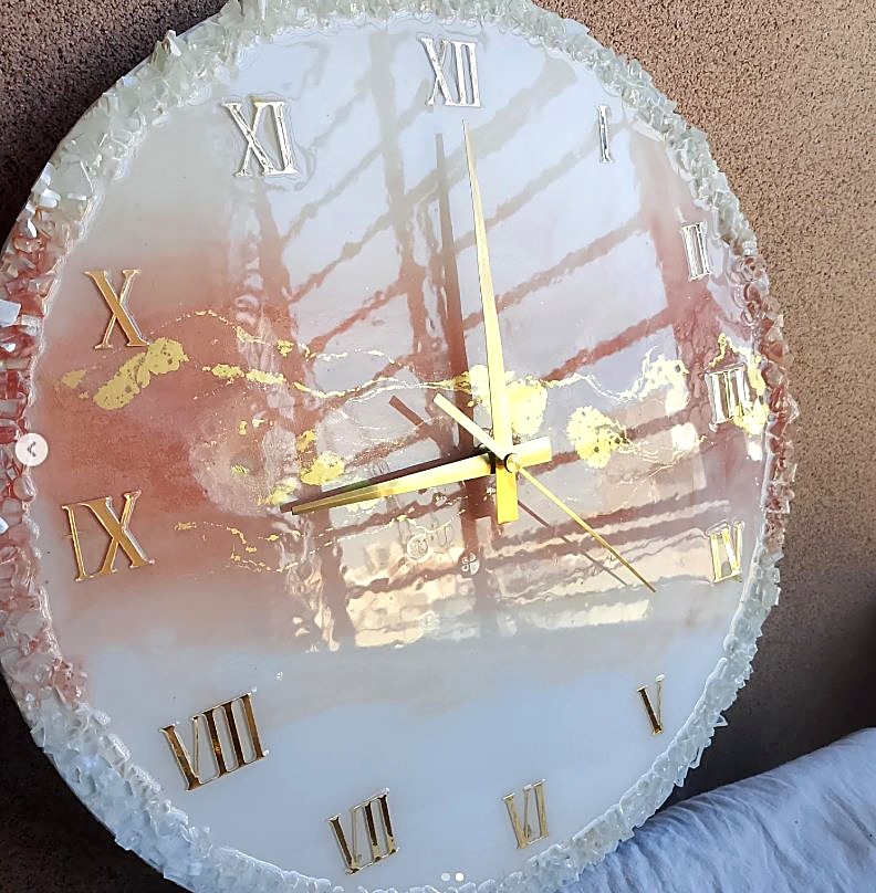
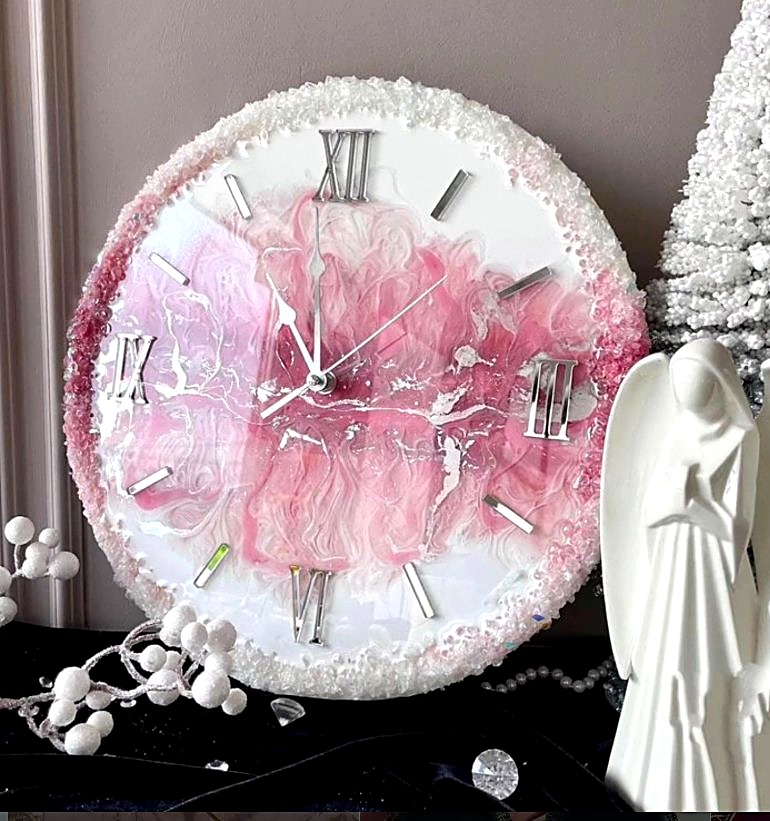
Time, captured in resin. Marbled golds, soft pinks and deep onyx tones swirl together to create one-of-a-kind clock faces — a quiet centrepiece for any room.
Order Now
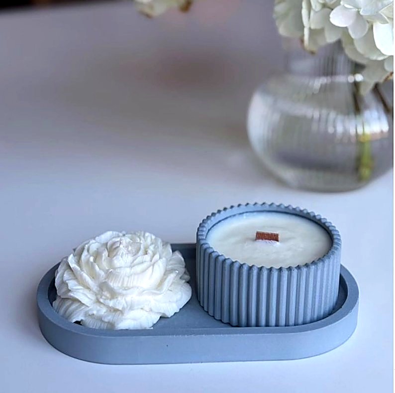
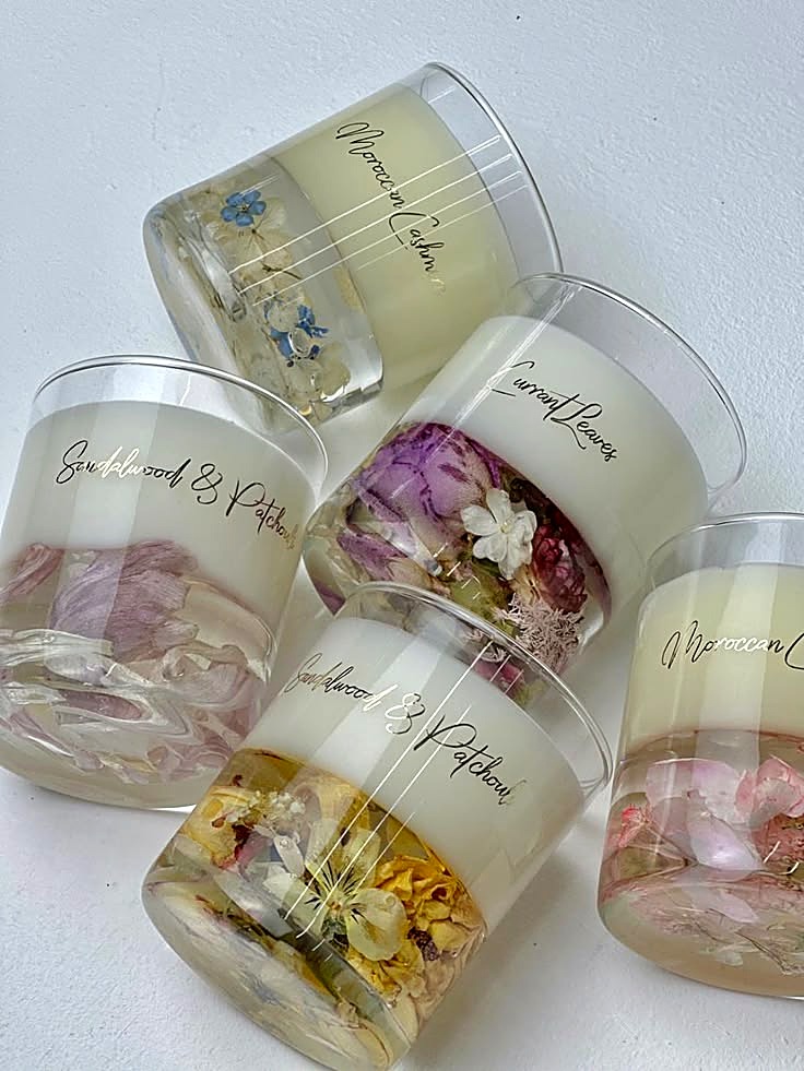
Hand-poured soy wax candles, sculpted into soft botanical forms and clean geometric vessels — equally beautiful lit or simply displayed.
Order Now
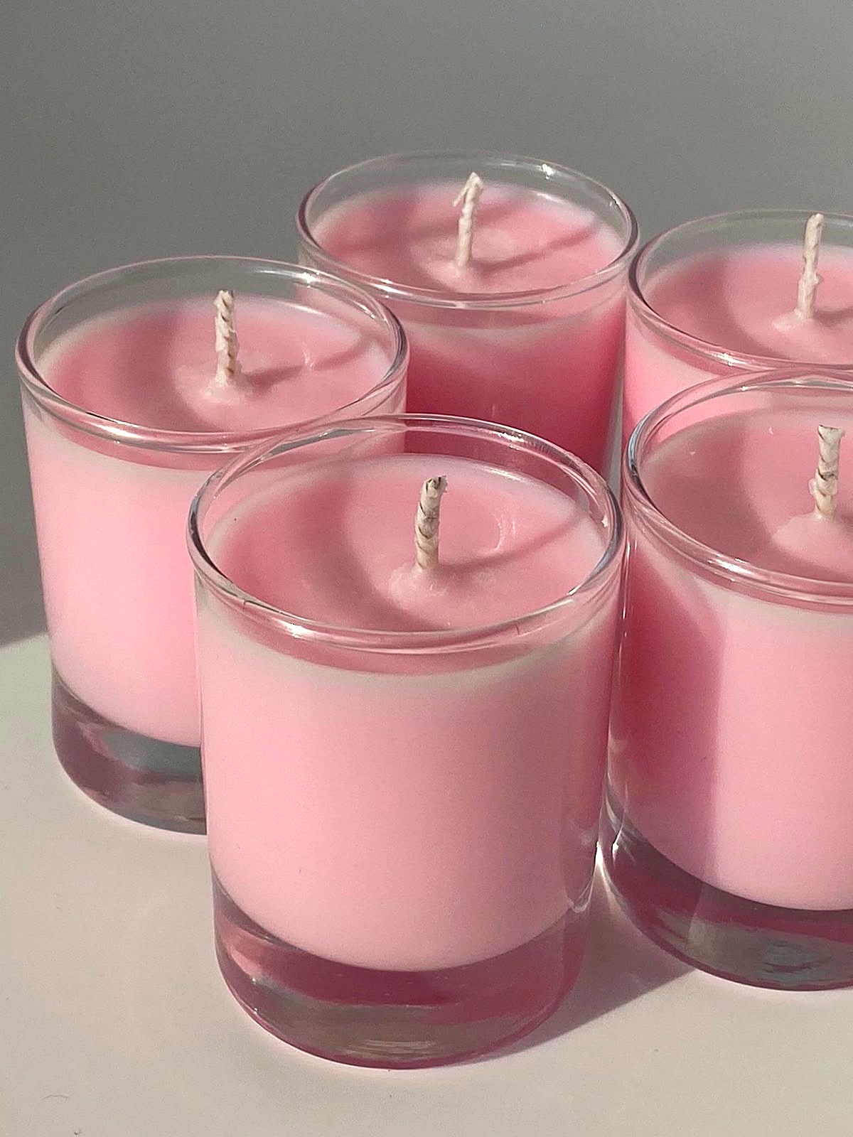
Soft fragrance layered into every pour, with dried florals set right into the wax — Sandalwood & Patchouli, Moroccan Cedar, Currant Leaves and more, each one a little ritual of calm.
Order Now
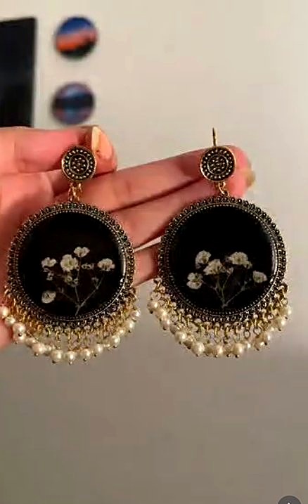
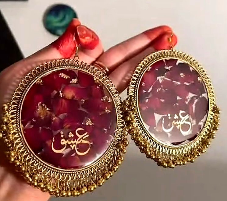
Resin jhumkas that bring colour and craft to traditional jewellery — pressed florals, shimmer and Arabic calligraphy set in resin, finished with pearls and gold detailing. Lightweight, vivid and entirely handmade.
Order Now
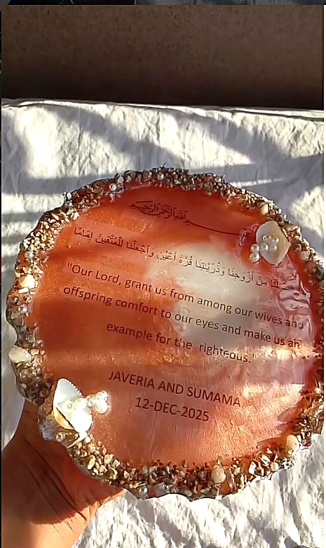
Verses and duas suspended in resin, framed with shells, pearls and gold leaf — meaningful pieces for your home, or treasured wedding and Walima keepsakes.
Order Now
A closer look at recent pieces — tap any image for a closer view.


We love bringing personal ideas to life — your choice of colours, sizes, names, dates or Quranic verses, made into a one-of-a-kind resin piece just for you. Whether it's a wedding gift, a Walima keepsake or a custom piece for your home, tell us your vision and we'll help shape it.
Message us on WhatsApp to discuss your custom order"The clock I ordered was even more beautiful in person. The gold detailing and packaging felt so premium — you can tell it's made with so much care."
"We ordered a custom resin plate with a dua for our Walima and it became the highlight of our décor table. Everyone asked where it was from!"
"Ordering on WhatsApp was so easy — quick replies, helpful suggestions, and the candles smell amazing. Will definitely be ordering again for gifts."
Yes! Custom colours, sizes, names, dates and Quranic verses can all be incorporated. Message us on WhatsApp with your idea and we'll guide you through the options.
Simply tap any "Order on WhatsApp" button on this site, or message us directly. Share what you'd like, your preferred colours/sizes, and your delivery details — we'll confirm everything with you before starting.
Most pieces are made within 5–10 working days, depending on size and design complexity. Custom and large pieces may take a little longer — we'll always share an estimated timeline when you order.
Absolutely — names, dates, initials and short messages can be added to clocks, plates and keepsakes, making them perfect for weddings, anniversaries, birthdays and Walimas.
Yes, we deliver across Pakistan via trusted courier services, with secure cushioned packaging so every piece arrives safely. Delivery charges and timelines depend on your city.
For orders, custom requests or just to say hello — reach out on WhatsApp for the fastest response, or use the form.